Pindustry
Case Study
Featured Review in Brand New
〰️
Featured Review in Brand New 〰️
Brand identity design for Denver’s top of class, go-to entertainment, and eatery.
Colorado real estate development leaders Bob and Don of Kelmore Development, who have been experts in real estate development for over 40 years, were looking to convert one of their properties into a restaurant and entertainment venue in the rapidly growing Greenwood Village neighborhood.


It all started with a mural …
The founder of Pindustry initially came to me to design murals for his new mixed-use facility. He loved the large scale murals I designed for Culinary Dropout and was looking for an experienced designer to work with him on making a similar type of impact for his new concept.
The problemThe project was already underway, but there was no one designing the brand identity. Without a creative director, the brand experience was disjointed.

I was excited to create murals for this restaurant because art moves people. As much as I love creating one-off art pieces, I equally love designing cohesive brand identity systems.
What moves me is helping people understand the obstacles they don’t yet see, inspire them to discover who they are and create brand assets to represent that visually.
So, I invited Bob to consider the impact of having a cohesive visual identity. This was the turning point in partnering together as the creative leader and defining the unique brand attributes of Pindustry.
But where do we start?
We started by asking lots of questions.
The discovery session provided much-needed clarity for who Pindustry is.
First, we wanted to understand the story of this place and what it’s going to be about. The goal was to create a unique and magical place, where time stops. No other eatery and entertainment venue in the region can boast of the number of offerings, the mix of refinement, or the incredible views of Denver from the rooftop deck.
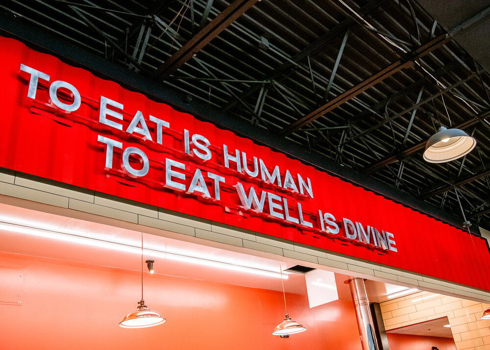
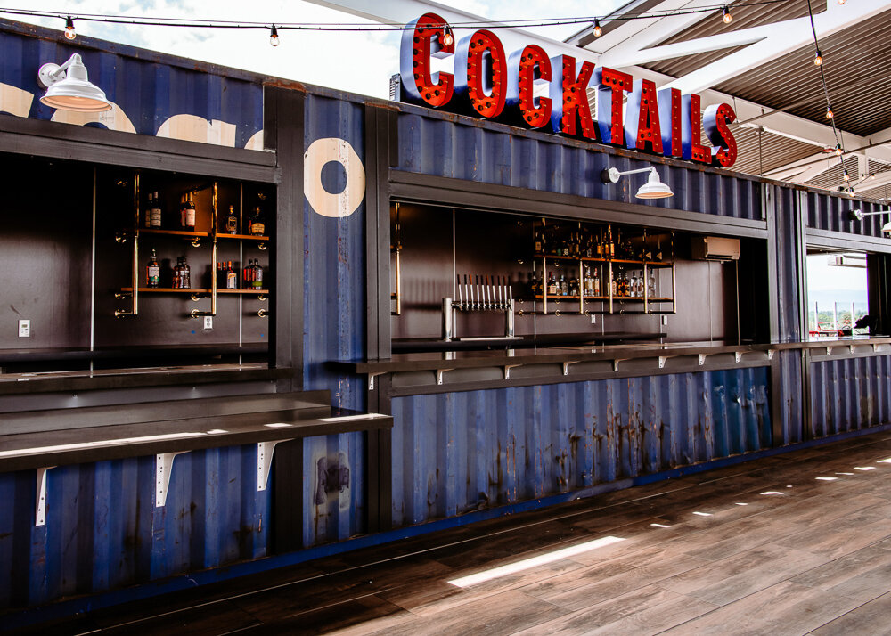
We pulled inspiration from the fact that space was previously used as an automotive workshop and combined that with influences from the spirit of 1920s social culture centered on having fun and enjoying life. The jazz club scene at the time brought with it great visuals of music, dance, and art deco details. We mixed all of that together.

Equal parts roaring twenties glitz and hard working industrial.
Games
Lanes
Music
These are the three pillars that the brand is built on. Nowhere else can you go to grab a slice of pizza, sip a craft cocktail, experience live music, go bowling and play endless games all in one place.

Next, we started designing the logo.
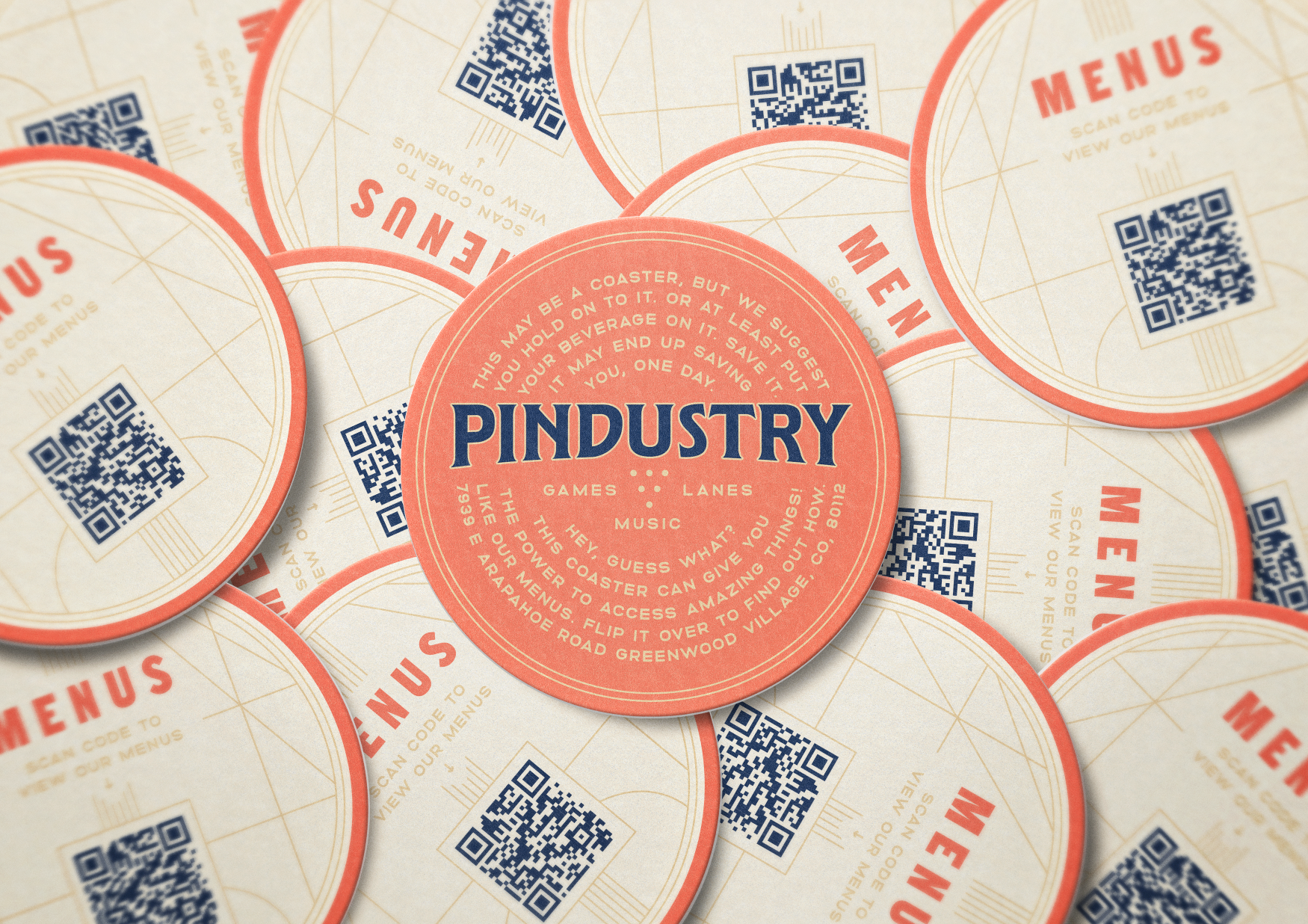
Logo and visual Identity
We also came up with a system of alternate badges with monospaced fonts and mono-linear strokes that would be used as textural elements. They became a supporting cast to the primary logo that would appear within the space.
We took inspiration from art deco details and combined it with the simplicity of industrial design to create elements that would feel both raw and elegant.
We used the line work everywhere
and foil stamped them on everything we could.

Murals
Signage and wayfinding


Brand guidelines

Website
www.thepindustry.com
And finally …
Opening day was a success. Not even torrential rain and flooding could put a damper on the events.
The thousands of guests that came through that weekend were able to experience a complete vision and unified design system with every piece of the identity that they experienced. The owner was enthusiastic about how everything turned out.
With the design now complete, the owners are now fully prepared with all they need to take their new concept to new heights. Maybe even new markets?
SERVICESBranding Discovery, Brand Strategy, Logo Design, Visual Identity, Creative Direction, Art Direction, Interior & Exterior Murals, Environmental Signage, Wayfinding, Custom Illustration, Menu Design, Stationery, Promotional Collateral, Apparel Design, Web Design, Email Campaign Design, Brand Guidelines
Special thanksSign Painting by Timothy Brennan at Great Not Good Co. with additional help by Heart & Bone Signs, Andy Brown, Signs By Kurt and Top Shelf Signs
Photography by Lucy Beaugard
Bob Koontz and Don Siecke at Kelmore Development

Next Project


